Time Series Forecasting

Introduction
What is Business Analytics? It is an applied discipline, tasked with gaining insight into business operations and helping to make better, fact-based decisions: a basic pillar of being data-driven. It combines Statistics, Computer Sciences, Management Science, Operational Research, and much more.
It has three main components:
- Descriptive analytics: providing insight into business questions by summarizing and visualizing observed data. Typically based on simple summaries and charts1.
- Predictive analytics: providing insight into the possible future by extrapolating patterns found in the historical data. Typically making use of statistical or machine learning predictive models (remember the Statistical Learning and Data Analytic courses).
- Prescriptive analytics: providing ways to make the best possible decisions based on the available information.
What is the role of Time Series Analytics and Forecasting in Business Analytics?
Time series analysis is crucial in Business Intelligence (BI) and Business Analytics for predicting future trends, understanding past patterns, and making informed decisions. It enables organizations to extract valuable insights from temporal data, aiding in strategic planning, resource allocation, and risk management.
Accurate time series forecasting empowers businesses to optimize inventory, enhance production planning, and anticipate market fluctuations.
Incorporating machine learning, econometrics, and statistical methods in time series analysis enhances the precision of predictions, providing a competitive edge. In BI, timely and reliable forecasts contribute to effective decision-making, improving overall business performance and adaptability to dynamic market conditions.
Syllabus:
- Time series data.
- Patterns: seasonality and trends.
- Autocorrelation.
- Transformations.
- Decomposition.
- Exponential Smoothing methods.
Forecasting and Time Series
Predictions have been a human interest throughout history. The ability to forecast depends on:
- How much we understand the factors at play, whether our model of the phenomenon is good or not.
- How much data is available.
- How similar the future will be to the past.
- The volatility of the process of interest.
- Whether the forecasts can affect the thing we are trying to forecast.
Data-based forecasts should be based on relevant data of the highest possible quality.
However, data are not always available.
- Qualitative forecasting is used when no data is available.
- Quantitative forecasting is used when relevant numerical data is available and is representative of some aspect of the past.
Quantitative methods must be appropriate for the problem and for the data used to solve it. Specific methods are used for time series data.
In time series, time is a defining property of the data. While it is a continuous variable, sampling usually occurs at regularly spaced intervals, giving regular time steps that represent the frequency of the data.
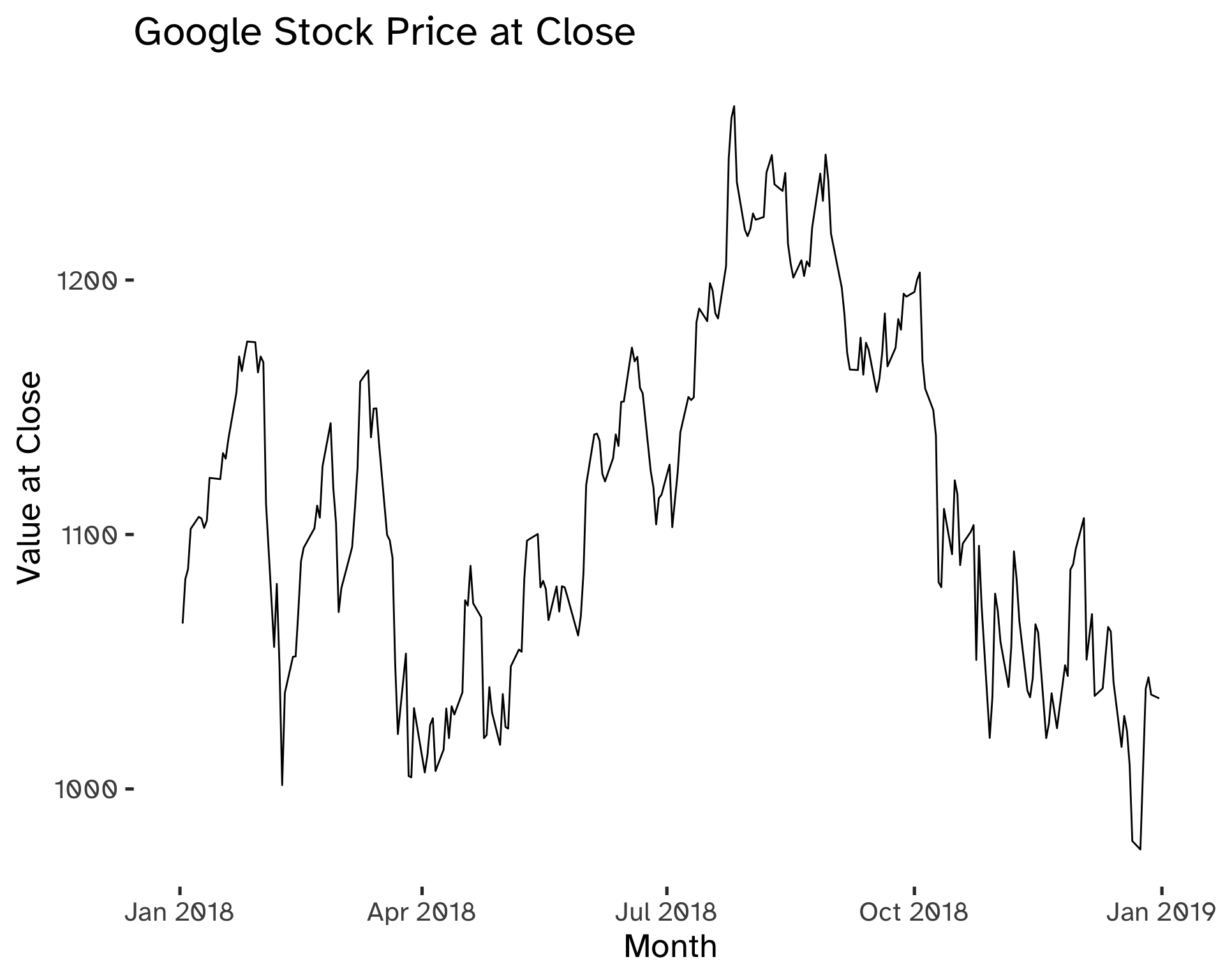
Code
gafa_stock %>%
  filter(
    Symbol == "GOOG",
    year(Date) == 2018
  ) %>%
  autoplot(
    Close
  ) +
  labs(
    title = "Google Stock Price at Close",
    x = "Month",
    y = "Value at Close"
  )
Forecasting: the Statistical Perspective
The phenomenon that we want to forecast can be conceptualized as a stochastic process, which is a succession of stochastic variables \{ y_t \}. If we consider its value at time T, given \mathcal{I} the set of all available observations for t = 1, 2, …, T -1, we can express the forecast distribution as a joint distribution, conditional on the available information: y_t \vert \mathcal{I}. This notation means: “the random variable y_t, given all that we know in \mathcal{I}”.
- The point forecast will be the mean or the median of y_t \vert \mathcal{I}.
- The forecast variance is V(y_t \vert \mathcal{I}).
- A prediction interval or interval forecast is a range of y_t values with high probability.
When we are dealing with time series, we have:
- y_{t \vert t-1} = y_{t} \vert \{ y_1, y_2, …, y_{t-1} \}.
A h-step forecast that takes into account all observations up to time T is expressed as:
\hat y_{T + h \vert T} = \mathbb{E} (y_{T + h}\vert y_1, …, y_T) \tag{1}
Models are useful to forecast because they account for uncertainty.
Patterns
We can filter three different components of the time series. These are patterns that can be used to forecast more effectively if identified correctly.
- Trend: long-term increase or decrease in the data.
- Seasonal: a series is influenced by a seasonal factor at a fixed period (quarterly, monthly, weekly, daily, hourly).
- Cyclic: data exibit rises and falls that are not of fixed period.
Cyclic patterns have a duration of at least 2 years. Seasonal patterns cannot have a periodicity longer than the year and are of constant length. The magnitude of a cycle is often more variable than the magnitude of a seasonal pattern.
The main implication of the differences between seasonal and cyclic patterns is that the timing of peaks and troughs is predictable with seasonal data, but unpredictable in the long term with cyclic data.
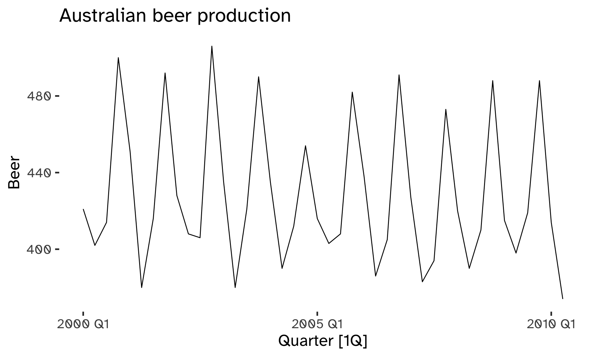
Code
aus_production %>%
  filter(
    year(Quarter) >= 2000
  ) %>%
  autoplot(Beer) +
  labs(
    title = "Australian beer production"
  )
Code
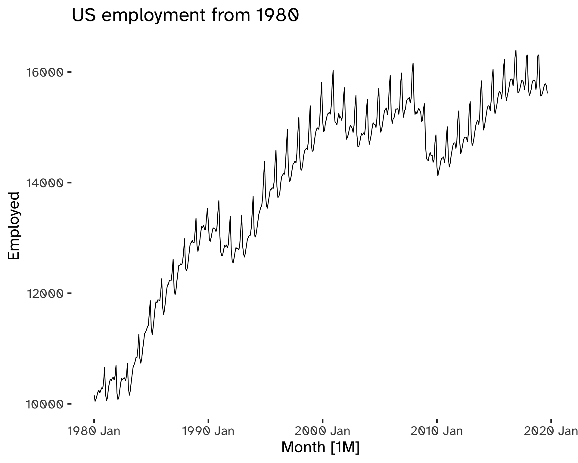
us_employment %>%
     filter(
        Title == "Retail Trade",
        year(Month) >= 1980) %>%
    autoplot(
    Employed
    ) +
    geom_rangeframe() %>%
    labs(
    title = "US employment from 1980"
  )
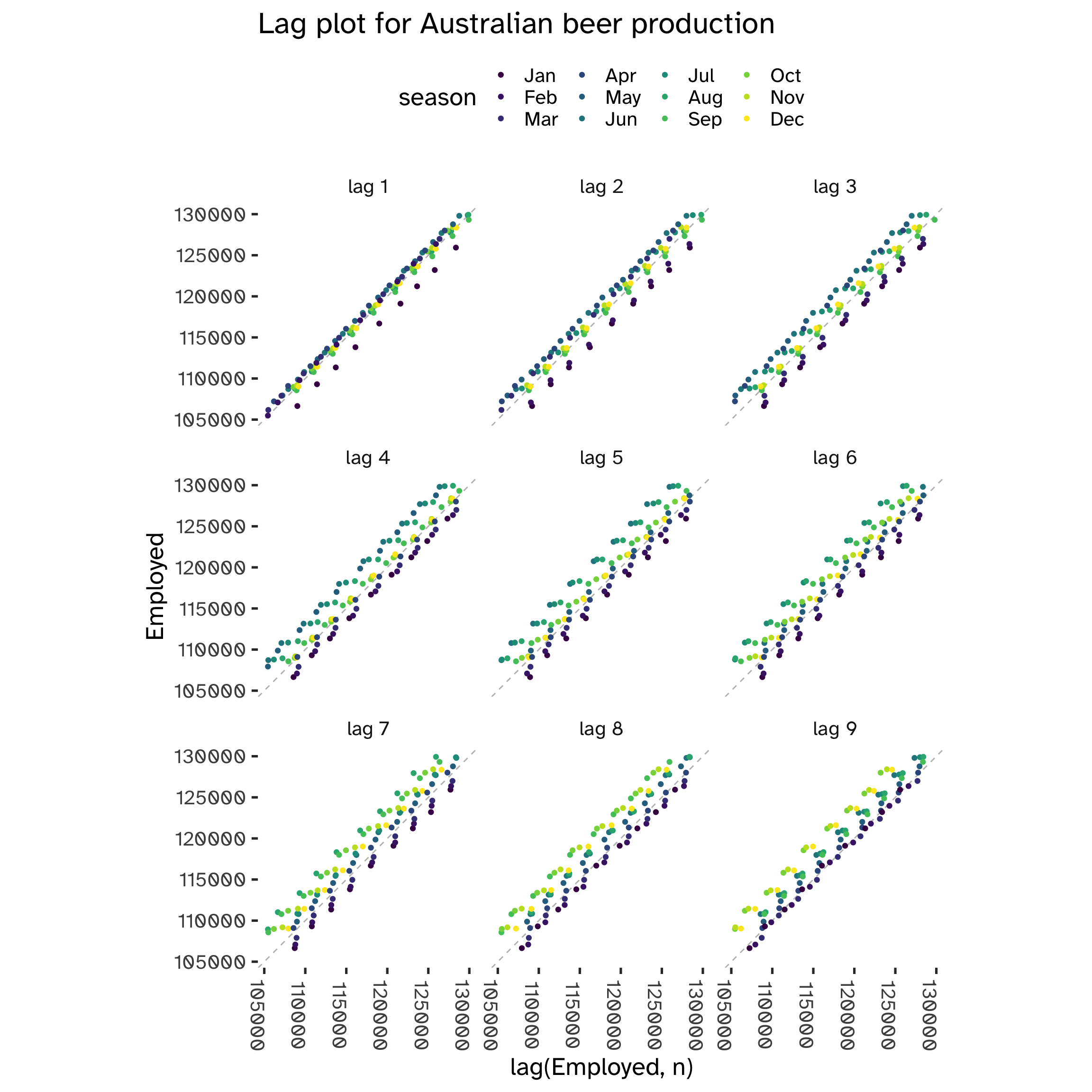
Autocorrelation
While in standard regression models we assume independence among the observations, this is not true with time series models. We can visualize this by comparing y_t against y_{t-k} for different values of k. k is the lag vaue, while y_{t-k} the lagged value: we define autocorrelation the linear dependence of a variable with its lagged values2.
Code
aus_production %>%
  gg_lag(
    Beer,
    geom = "point"
  ) +
  labs(
    title = "Lag plot for Australian beer production"
  ) +
  theme(
    axis.text.x = element_text(angle = 270),
  )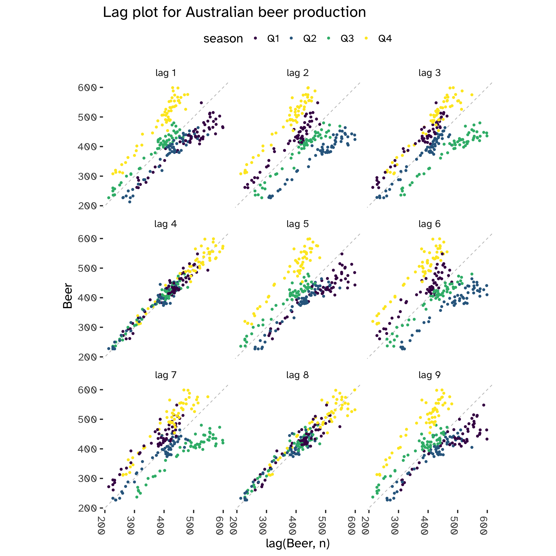
From the following plot, we can see that at each 4th lag3 there is clear evidence of a correlation between y_t and y_{t-k}. This is a tell-tale sign of seasonality.
However, not always we can spot it using visualization techniques:
Code
us_employment %>%
  filter(
    year(Month) >= 2010,
    Series_ID == "CEU0500000001"
  ) %>%
  gg_lag(
    Employed,
    geom = "point"
  ) +
  labs(
    title = "Lag plot for Australian beer production"
  ) +
  theme(
    axis.text.x = element_text(angle = 270),
  )
When multiple patterns overlap, we cannot use these lag charts to spot seasonality.
Autovariance and Autocorrelation
Autocovariance and autocorrelation measure linear relations between lagged values of a time series y.
- c_k: sample autocovariane at lag k.
- r_k: sample autocorrelation at lag k4.
c_k = \frac{1}{T} \sum_{t = k + 1}^T (y_t - \bar y)(y_{t - k} - \bar y) \tag{2}
r_k = \frac{c_k}{c_0} \tag{3}
We can visualize the autocorrelations with a correlogram plot5:
Code
aus_production %>%
filter(
    year(Quarter) >= 2000
  ) %>%
    ACF(
        Beer,
        lag_max = 8
    ) %>%
    autoplot()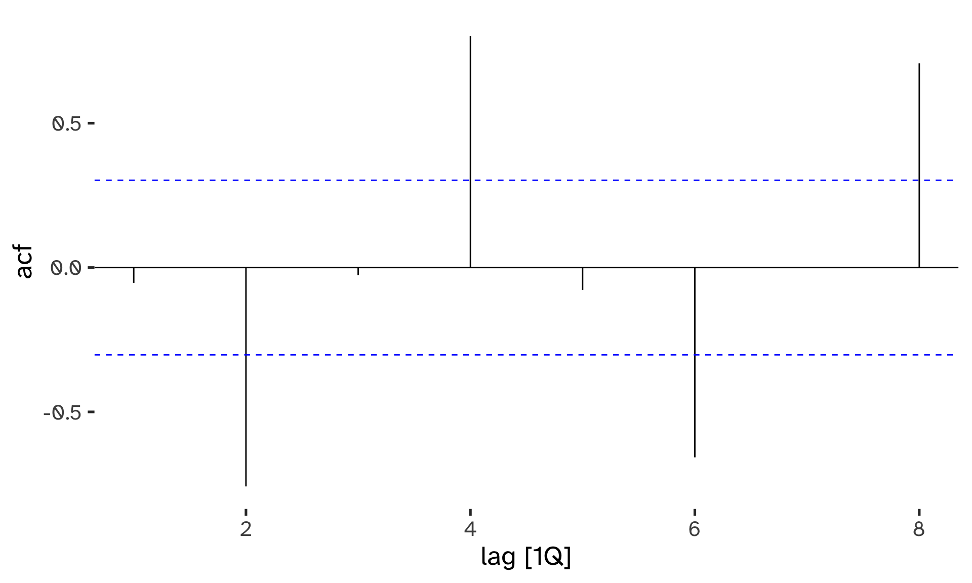
Code
us_employment %>%
    filter(
        Title == "Retail Trade",
        year(Month) >= 1980
        ) %>%
        ACF(
            Employed,
            lag_max = 32
        ) %>%
        autoplot()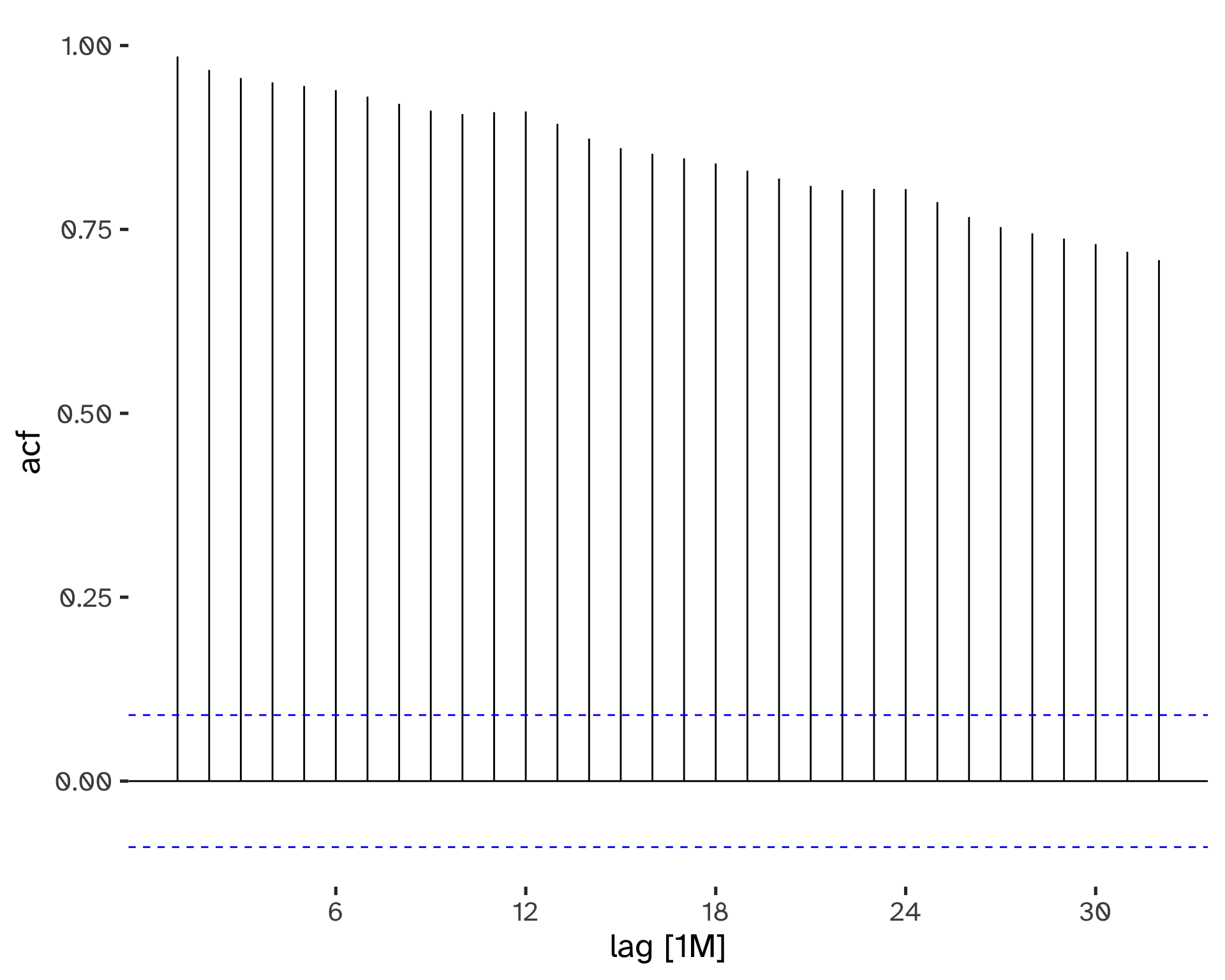
- When data have a trend, the autocorrelations for small lags tend to be large and positive.
- When data are seasonal, the autocorrelation will be larger at the seasonal lags6.
- When data are trended and seasonal, you see a combination of these effects.
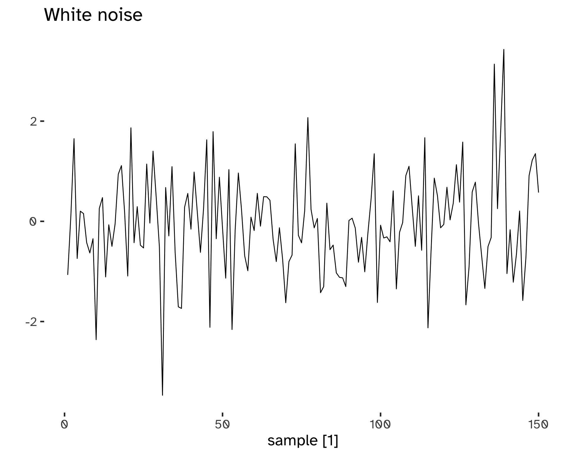
Time series that show no autocorrelation are called white noise.
This is a benchmark: if a series has a small r_k, we can assume that behaves like white noise. The sampling distribution for white noise data is (asymptotically) N(0, 1/T), therefore we can build confidence intervals, usually at \alpha=5%.
Code
tsibble(
    sample = 1:150,
    wn = rnorm(150),
    index = sample
    ) %>%
    autoplot(wn) +
    labs(
        title = "White noise",
        y = ""
    )
Code
tsibble(
    sample = 1:150,
    wn = rnorm(150),
    index = sample
    ) %>%
    ACF() %>%
    autoplot()
Response variable not specified, automatically selected `var = wn`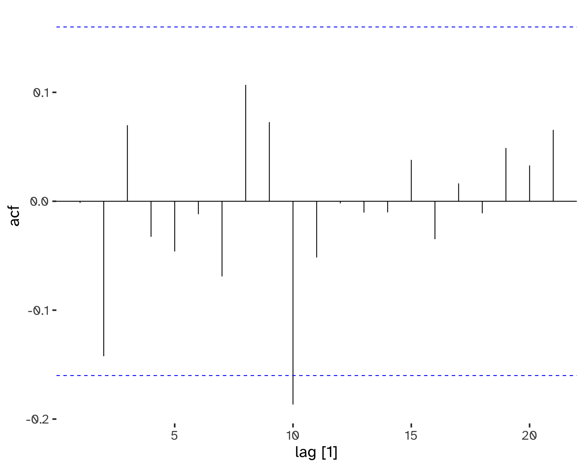
We can see that even if there is slight evidence of correlation, the confidence intervals help in choosing to label the series as white noise: it is not statistically significant.
Transformations
Transformations have many uses: adjusting the series helps with decomposition and comparisons; also, stabilizing the variance simplifies subsequent analysis.
We have four main classes of transformations, dealing with economic data:
- Calendar adjustments.
- Population adjustments.
- Inflation adjustments.
- Mathematical transformations.
Code
p1 <- global_economy %>%
  filter(
    Country == "Australia" |
    Country == "Italy"
    ) %>%
  autoplot(GDP) +
  labs(
    title= "GDP",
    y = "$US"
    ) +
  theme(
    legend.position = "none"
  )
p2 <- global_economy %>%
 filter(
    Country == "Australia" |
    Country == "Italy"
    ) %>%
  autoplot(Population) +
  labs(
    title= "Population",
    y = "$US"
    ) +
  theme(
    legend.position = "none"
  )
p3 <- global_economy %>%
  filter(
    Country == "Australia" |
    Country == "Italy"
    ) %>%
  autoplot(GDP/Population) +
  labs(
    title= "GDP per capita",
    y = "$US"
    )

(p1 + p2) / p3 + plot_annotation(
  title = "Transformation example: from GDP to GDP per capita"
)![]()
Mathematical transformations are useful to stabilize the variability of the time series, which should be constant: when it varies with the level of the series, a log transformation can eliminate the issue7, Changes in a log value are relative changes on the original scale.
Y_t = b_t X_t \to log(Y_t) = log(b_t) * log(X_t) \tag{4}
Code
p1 <- aus_production %>%
  autoplot(Gas)
p2 <- aus_production %>%
  autoplot(
    log(
      Gas
      )
    ) +
  labs(
    y = expression(log(Gas))
  )

p1 / p2 + plot_annotation(
  title = "Log transformations"
)![]()
Choosing an interpretable transformation is a great advantage. Simple transformations go a long way.
Decomposition
Time series values can be decomposed as a function of their patterns:
y_t = f(S_t, T_t, R_t) \tag{5}
We can identify a seasonal and a trend component; there is also a remainder that accounts for the unexplained variability.
- y_t = data at period t.
- T_t = trend-cycle component at period t.
- S_t = seasonal component at period t.
- R_t = remainder at period t.
Additive decomposition:
y_t = S_t + T_t + R_t \tag{6}
The additive model is appropriate if the magnitude of seasonal fluctuations does not vary with level.
Multiplicative decompositions
y_t = S_t \times T_t \times R_t \tag{7}
If seasonal changes are proportional to the level of the series, then a multiplicative model is appropriate8.
There are several approaches to decomposition:
- Classical Decomposition
- Seasonal Decomposition of Time Series by Loess (STL)
- X11/SEATS9.
The focus is on classical decomposition; it can be performed for additive and multiplicative seasonality. To estimate the trend at time t, Moving Averages (MA) of order m are computed on the time series values.
Code
 us_employment |>
     filter(
       Title == "Retail Trade",
       year(Month) >= 1980
       ) %>%
     model(
       classical_decomposition(
         Employed,
         type = "additive"
         )
       ) %>%
     components() %>%
     autoplot() +
  labs(
    x = "Year",
    title = "Classical additive decomposition \n of total US retail employment"
    )
Warning: Removed 6 rows containing missing values (`geom_line()`).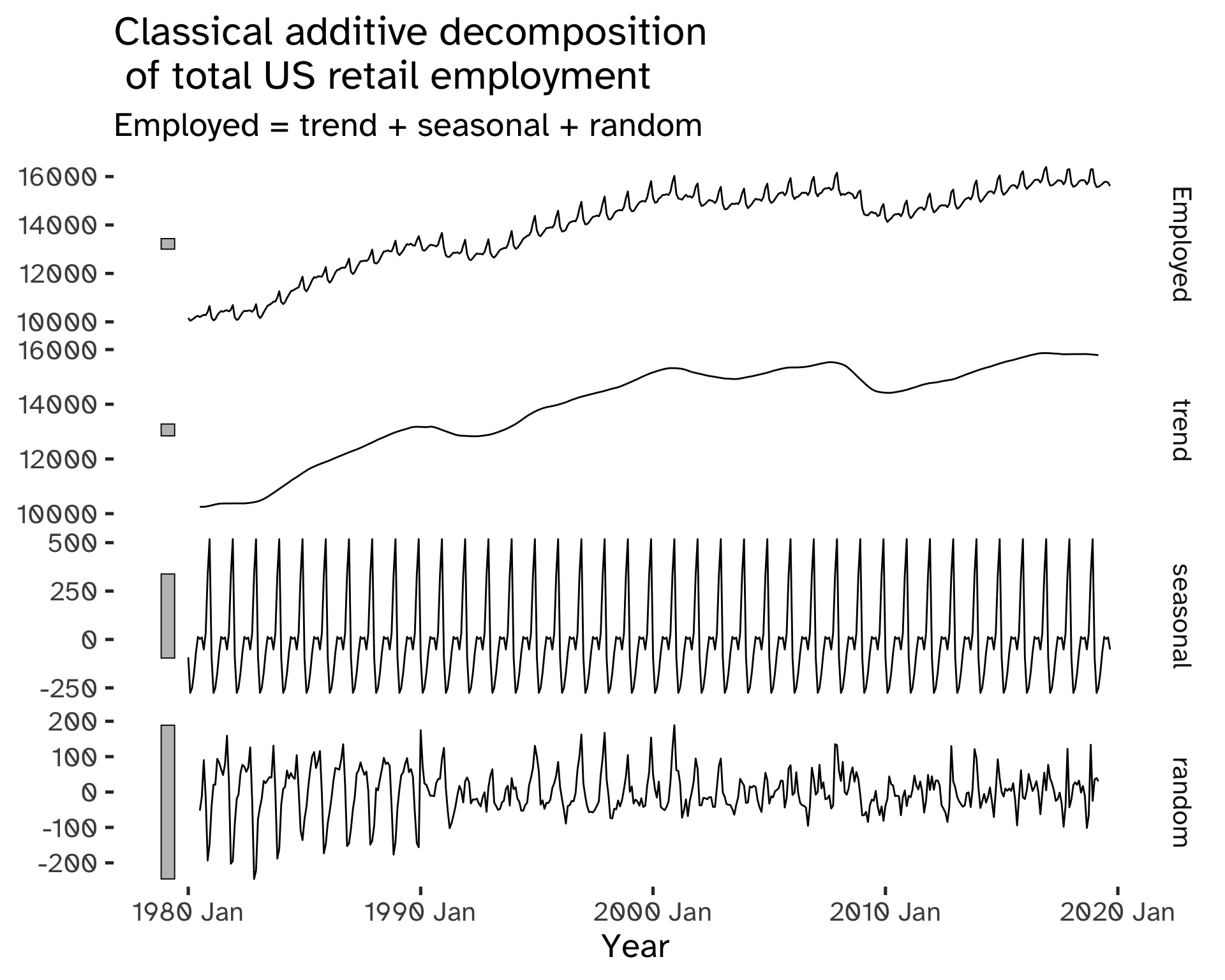
Code
aus_production %>%
  filter(
    year(Quarter) >= 2000
  ) %>%
  model(
       classical_decomposition(
         Beer,
         type = "additive"
         )
       ) %>%
     components() %>%
     autoplot() +
  labs(
    x = "Year",
    title = "Classical additive decomposition \n AUS beer production"
    )
Warning: Removed 2 rows containing missing values (`geom_line()`).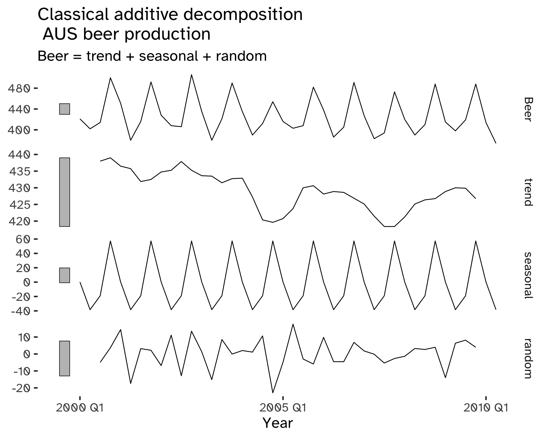
The trend component of classical decomposition is estimated with a moving average.
Moving Averages
A moving average of order m can be written as:
\hat T_t = \frac{1}{M} \sum_{j = -k}^k y_{t + j} \qquad m = 2k + 1 \tag{8}
m is odd, therefore the MA is symmetric and centered at time t; it is a paramenter that controls how smooth the estimate is10.
Code
global_economy %>%
  filter(Country == "Italy") %>%
  mutate(
    `5-MA` = slider::slide_dbl(
      Exports,
      mean,
      .before = 2,
      .after = 2,
      .complete = TRUE
      ),
    `9-MA` = slider::slide_dbl(
      Exports,
      mean,
      .before = 4,
      .after = 4,
      .complete = TRUE
      )
  ) %>%
  autoplot(Exports) +
  geom_line(
    aes(
      y = `5-MA`,
      colour = "darkorange"
      ),
    ) +
  geom_line(
    aes(
      y = `9-MA`,
      colour = "dodgerblue"
      ),
    ) +
  labs(
    y = "% of GDP",
    title = "Total Australian exports",
    colour = "MA smoothings"
    ) +
  scale_color_discrete(
    labels = c(
      "5-MA",
      "9-MA"
      )
    )
Warning: Removed 4 rows containing missing values (`geom_line()`).Warning: Removed 8 rows containing missing values (`geom_line()`).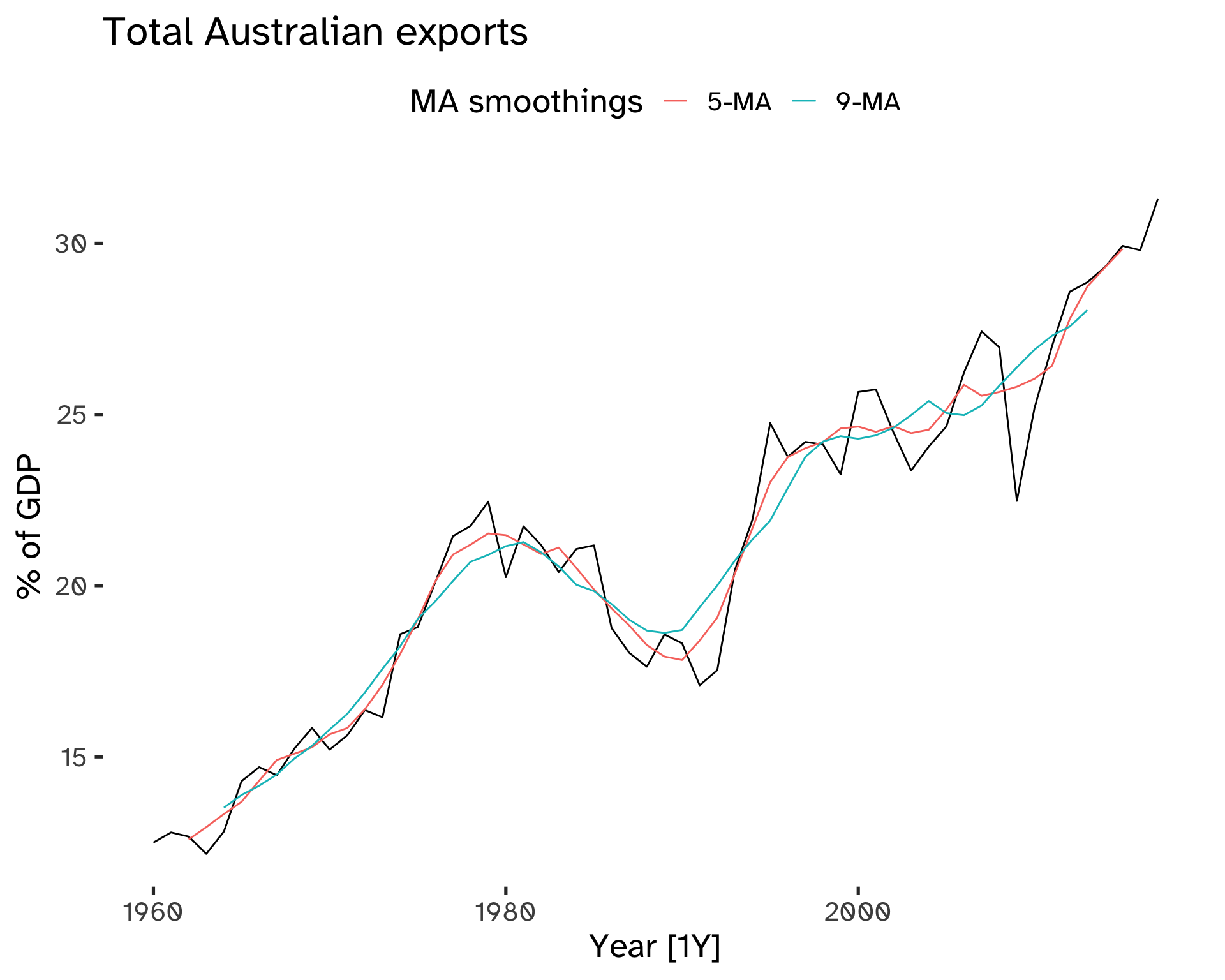
The beginning and end of MA trends are missing: this is caused by the fact that we cannot compute the average near the boundaries of our dataset.
For seasonal data the choice of m is fundamental:
Code
vic_elec |>
  filter(year(Time) == 2014) |>
  index_by(Date = date(Time)) %>%
summarise(
    Demand = sum(Demand) / 1e3
  ) %>%  mutate(
    `5-MA` = slider::slide_dbl(
      Demand,
      mean,
      .before = 2,
      .after = 2,
      .complete = TRUE
      ),
    `11-MA` = slider::slide_dbl(
      Demand,
      mean,
      .before = 5,
      .after = 5,
      .complete = TRUE
      )
  ) %>%
  ggplot(
    aes(
      x = Date
    )
  ) +
  geom_line(
    aes(
      y = Demand
    )
  ) +
  geom_line(
    aes(
      y = `5-MA`,
      colour = "darkorange"
    )
  ) +
  geom_line(
    aes(
      y = `11-MA`,
      colour = "dodgerblue"
    )
  ) +
  labs(
    title = "Monthly electricity demand for 2014",
    colour = "MA smoothings"
  )  +
  scale_color_discrete(
    labels = c(
      "5-MA",
      "9-MA"
      )
    )
Warning: Removed 4 rows containing missing values (`geom_line()`).Warning: Removed 10 rows containing missing values (`geom_line()`).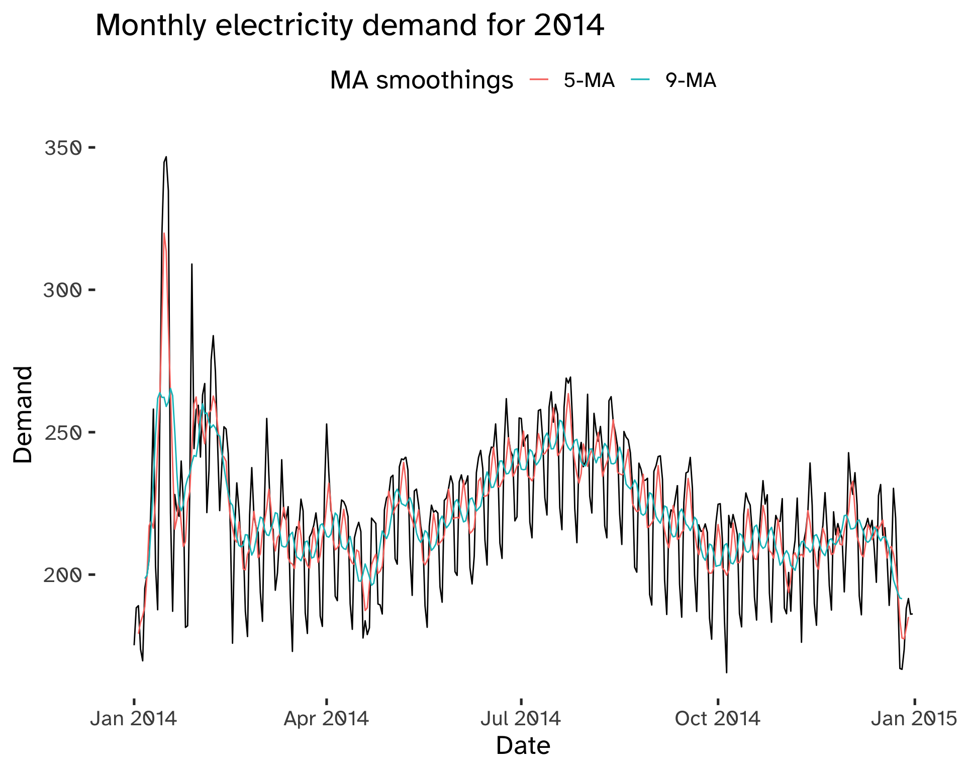
To smooth out the seasonal component we use moving averages of the order of the periodicity of the seasonality.
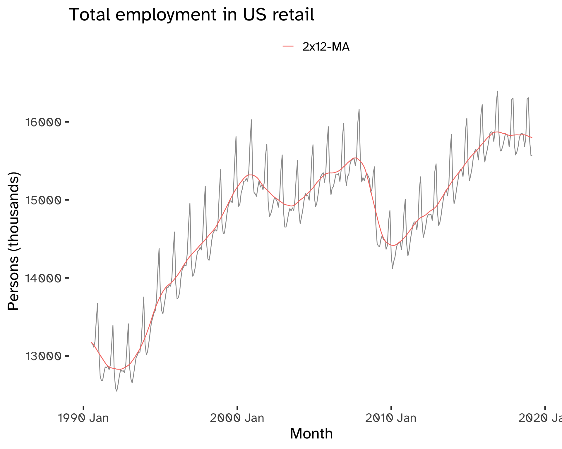
For example, in the case of weekly data, we can use a 7-MA. If we have even numbers, we can take a moving average of a moving average: this allows centering of the data and keeping symmetry11.
For seasonal data with even period m take 2 × MA of period m.
Code
us_employment %>%
     filter(
       year(Month) >= 1990,
       Title == "Retail Trade"
       ) %>%
     select(
       -Series_ID
       ) %>%
     mutate(
       `12-MA` = slider::slide_dbl(
         Employed,
         mean,
         .before = 5,
         .after = 6,
         .complete = TRUE
         ),
       `2x12-MA` = slider::slide_dbl(
         `12-MA`,
         mean,
         .before = 1,
         .after = 0,
         .complete = TRUE
         )
       ) %>%
     na.omit() %>%
     ggplot(
       aes(
         x = Month
       )
     ) +
  geom_line(
    aes(
      y = Employed,
      ),
       color = "grey60"
    ) +
  geom_line(
    aes(
      y = `2x12-MA`,
       color = "darkorange"
      )
    )+
  labs(
       y = "Persons (thousands)",
       title = "Total employment in US retail",
       color = ""
     ) +
  scale_color_discrete(
    labels = c(
      "2x12-MA"
      )
    )
Classical Decomposition
To obtain this decomposition, the following steps are needed:
- The trend-cycle component is estimated using the appropriate MA smoothing.
If m is even, use 2x m-NA; if m is odd, use m-MA.
The main assumption is that the season pattern is the same across time.
Additive (classical) Decomposition
- Derive the de-trended series:
y_t - \hat{T}_t \tag{9}
3a. Estimate the seasonal components by taking the average of all detrended values for each for that season12.
3b. Correct the individual seasonal terms to ensure they sum to 0.
- The remainder component is calculated by subtracting the estimated seasonal and trend-cycle components:
\hat{R}_t = y_t - \hat{T}_t - \hat{S}_t \tag{10}
- Derive a de-seasonalized series as y_t - S_t.
Multiplicative (classical) Decomposition
- Derive the de-trended series:
\frac {y_t} {\hat{T}_t} \tag{11}
3a. Estimate the seasonal components by taking the average of all the detrended values for each for that season13.
3b. Correct the individual seasonal terms to ensure they sum to m.
- The remainder component is calculated by dividing out the estimated seasonal and trend-cycle components:
\hat{R}_t = \frac{y_t}{\hat{T}_t \hat{S}_t} \tag{12}
Code
p1 <- aus_production %>%
  filter(
    year(Quarter) >= 1970
  ) %>%
  autoplot(Gas)
p2 <- aus_production %>%
  filter(
    year(Quarter) >= 1970
  ) %>%
 model(
       classical_decomposition(
         Gas,
         type = "multiplicative"
         )
       ) %>%
     components() %>%
     autoplot() +
  labs(
    x = "Year",
    title = "Classical multiplicative decomposition \n AUS Gas production"
    )

p1 / p2
Warning: Removed 2 rows containing missing values (`geom_line()`).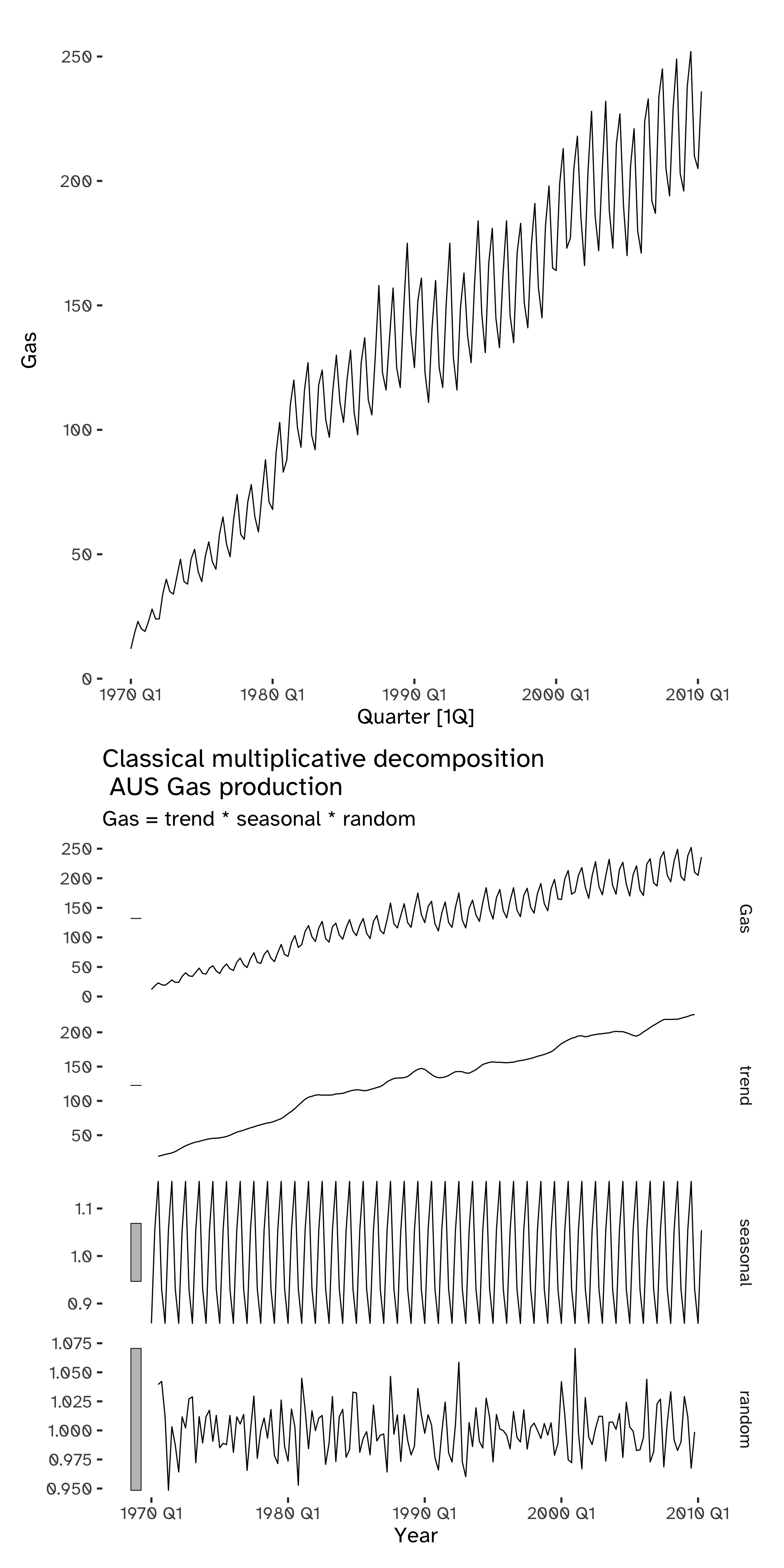
Exponential smoothing
Exponential smoothing is based on a simple concept: a weight is given to each observation; this weight decays exponentially, thus modifying the relative importance of the past values of a time series.
The decay rate can be adjusted and this method can be adapted for data with and without a trend and/or seasonal pattern.
Forecasting benchmark methods are represented by simple extremes:
- The forecast is equal to the mean of the past observations:
y_{T + h \vert T} = \frac{1}{T} \sum y_i \tag{13}
- The forecast is equal to the last observation:
y_{T + h \vert T} = y_T \tag{14}
Code
goog_stock %>%
  model(
    Mean = MEAN(Close),
    Naive = NAIVE(Close)
  )  %>%
  forecast(
    h = 50
    )  %>%
  autoplot(
    goog_stock,
    level = NULL
    ) +
  labs(
    title = "Google closing stock price",
    y = "$US"
    ) +
  guides(
    colour = guide_legend(
      title = "Forecast"
      )
    )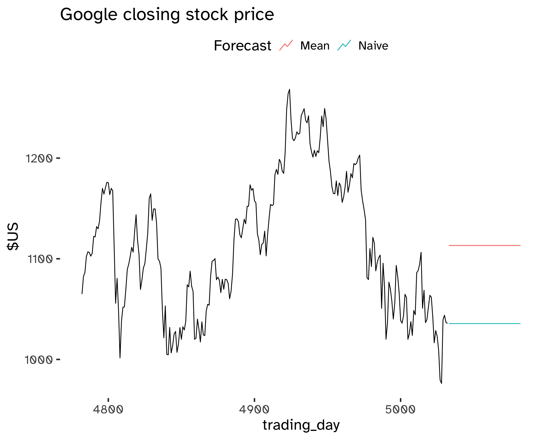
Exponential smoothing allows to achieve forecasts that are in between these extremes, giving heavier weights to later observations.
Naming conventions are attributed to the most important variation of exponential smoothing:
- Single Exponential Smoothing.
- Double Exponential Smoothing, or Holt’s linear trend method.
- Triple Exponential Smoothing, or Holt-Winter’s Method.
The single, double, or triple term refers to the number of smoothing equations that are comprised in the method. We can have a smoothing equation for the level (Simple Exponential Smoothing), a second one for the trend (Double Exponential Smoothing), a third (and final) one for the seasonal component (Triple Exponential Smoothing).
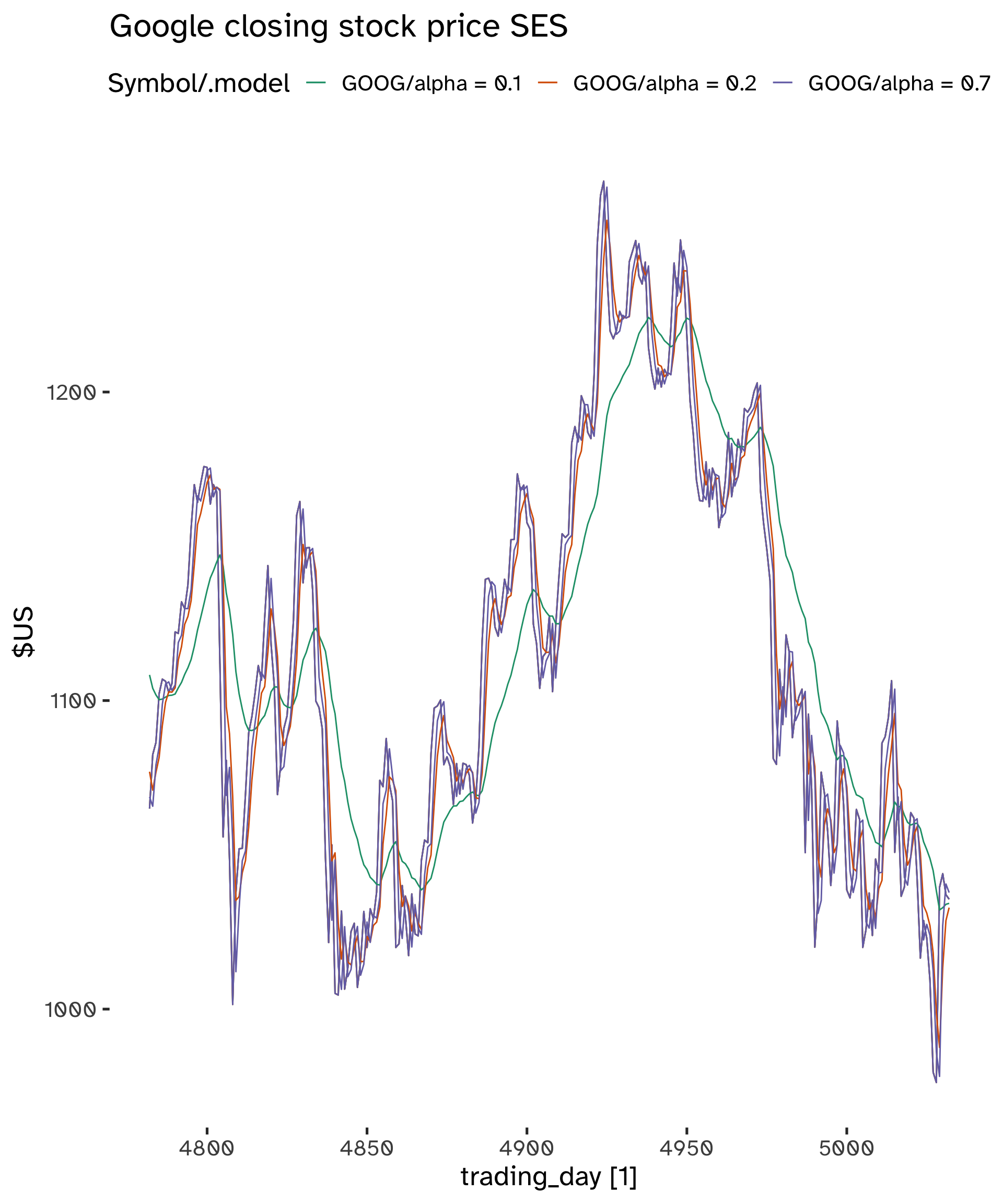
Simple Exponential Smoothing
This method is appropriate for data with no trend and no seasonality.
The forecast equation is:
\hat{y}_{T +1 \vert T} = \alpha y_T + \alpha (1 - \alpha) y_{T -1} + \alpha (1 - \alpha)^2 y_{T -2} + …
Where 0 \leq \alpha \leq 1, the smoothing parameter14.
Code
fit <- goog_stock %>%
  model(
    "alpha = 0.1" = ETS(Close ~ error("A") + trend("N", alpha = .1) + season("N")),
    "alpha = 0.2" = ETS(Close ~ error("A") + trend("N", alpha = .5) + season("N")),
    "alpha = 0.7" = ETS(Close ~ error("A") + trend("N", alpha = .8) + season("N"))
    )
fc <- fit %>%
  augment()
Code
fc  %>%
  autoplot(Close) +
  geom_line(
    aes(
      x = trading_day,
      y = .fitted
      )
    ) +
  labs(
    y="$US",
    title="Google closing stock price SES"
    ) +
  scale_color_brewer(
    type = "qual",
    palette = "Dark2"
    )
General Framework
Forecast equation:
\hat{y}_{t + h \vert t} = l_t \tag{15}
Smoothing equation:
l_t = \alpha y_t + (1 - \alpha) l_{t-1} \tag{16}
- l_t is the level (or smoothed value) of the series at time t.
- \hat{y}_{t + 1 \vert t} = \alpha y_t + (1 - \alpha) \hat{y}_{t \vert t -1}.
These two components can be iterated to get the exponentially weighted moving average form.
Weighted Average Form
Note that at time t = 1 we have to decide a value for l_0, because \hat{y}_{1 \vert 0} = l_015.
Iterating on Equation 15 and Equation 16 we get the following form, for time T + 1:
\hat{y}_{T + 1 \vert T} = \sum_{j = 0}^{T - 1} \alpha(1 - \alpha)^j y_{T - j} + (1 - \alpha)^T l_0 \tag{17}
The last term becomes very small for large T; the forecast consists of the weighted average of all observations.
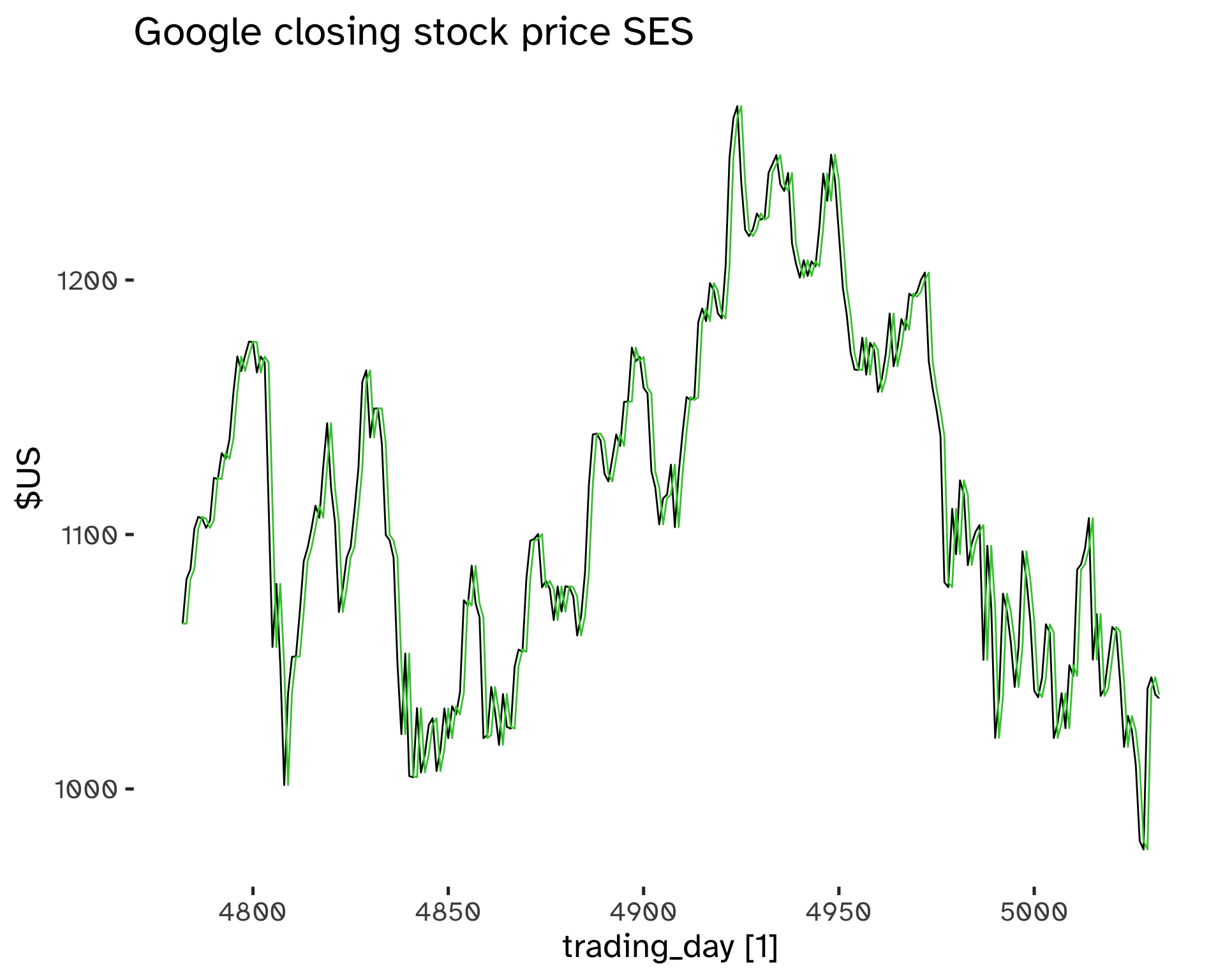
Smoothing Parameters Choice
The parameters to be estimated are \alpha and l_0. Similarly to regression, we can choose optimal parameters by minimizing the SSE16.
SSE = \sum_{t = 1}^T (y_t - \hat{y}_{t \vert t -1})^2 \tag{18}
There is not a closed-form solution: numerical optimization is needed.
Code
fit <- goog_stock %>%
  model(
    ETS(
      Close ~ error("A") + trend("N") + season("N"))
    )
fc <- fit %>%
  augment()
Code
tidy(fit)# A tibble: 2 × 4
Symbol .model term estimate
<chr> <chr> <chr> <dbl>
1 GOOG "ETS(Close ~ error(\"A\") + trend(\"N\") + season(\"N\"… alpha 1.00
2 GOOG "ETS(Close ~ error(\"A\") + trend(\"N\") + season(\"N\"… l[0] 1065. Code
fc  %>%
  autoplot(Close) +
  geom_line(
    aes(
      x = trading_day,
      y = .fitted
      ),
    color = "limegreen"
    ) +
  labs(
    y="$US",
    title="Google closing stock price SES"
    ) +
  scale_color_brewer(
    type = "qual",
    palette = "Dark2"
    )
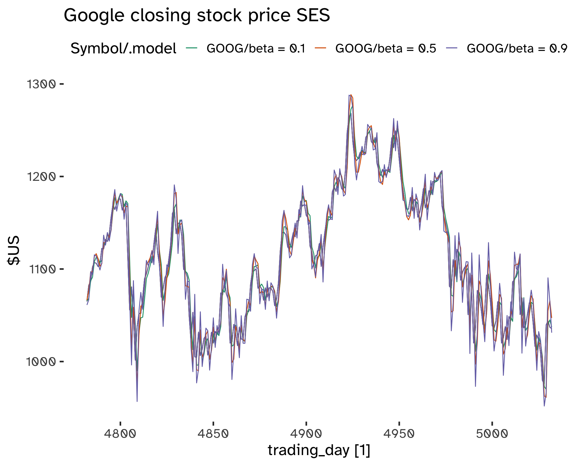
Models with Trend
The principle is the same as SES: we can estimate a trend by giving more weight to more recent changes. There are two extreme situations:
- y_T - y_{T - 1}
- y_T - y_1
The average change is \frac{y_T - y_1}{T}. This method is called Double Exponential Smoothing or Holt’s Method.
The component form is:
Forecast equation:
\hat{y}_{t + h \vert t} = l_t + hb_t \tag{19}
Level equation:
l_t = \alpha y_t + (1 - \alpha)(l_{t - 1} + b_{t - 1}) \tag{20}
Trend component:
b_t = \beta^* (l_t - l_{t - 1}) + (1 - \beta^*) b_{t - 1} \tag{21}
- We have two smoothing parameters, 0 \leq \alpha, \beta^* \leq 1.
- The l_t level is a weighted average between y_t and a one-step ahead forecast for time t.
- The b_t slope is the weighted average of (l_t - l_{t -1}) and b_{t - 1}, which are the current and previous estimate of the slope.
\alpha, \beta^*, l_0, b_0 are chosen to minimize the SSE.
Code
fit <- goog_stock %>%
  model(
    "beta = 0.1" = ETS(
      Close ~ error("A") + trend("A", beta = 0.1) + season("N")
      ),
    "beta = 0.5" = ETS(
      Close ~ error("A") + trend("A", beta = 0.5) + season("N")
      ),
    "beta = 0.9" = ETS(
      Close ~ error("A") + trend("A", beta = 0.9) + season("N")
      )
  )
fc <- fit %>%
  augment()
Code
fc  %>%
  autoplot(Close) +
  geom_line(
    aes(
      x = trading_day,
      y = .fitted
      )
    ) +
  labs(
    y="$US",
    title="Google closing stock price SES"
    ) +
  scale_color_brewer(
    type = "qual",
    palette = "Dark2"
    )
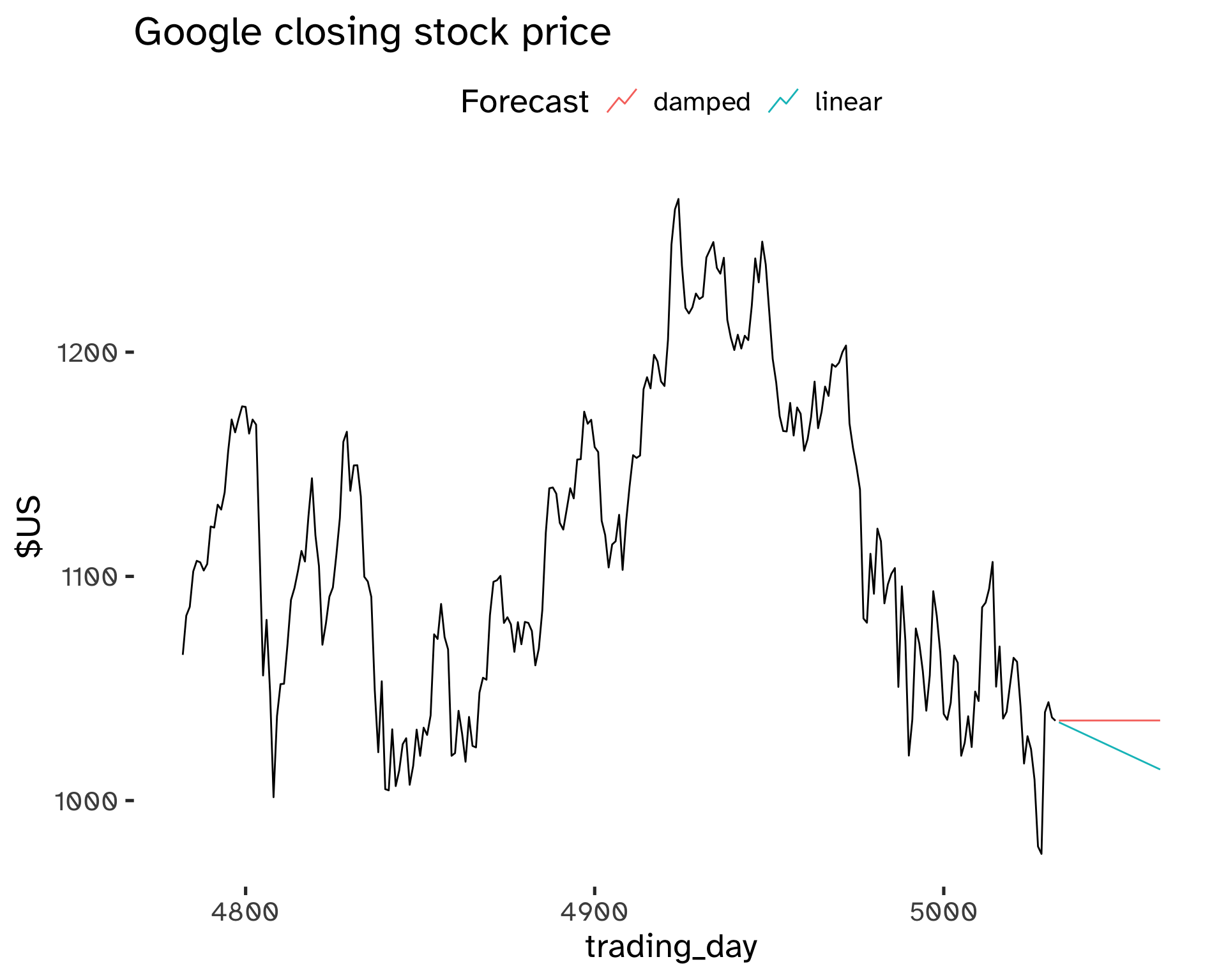
Damped Trend Method
In Holt’s method, the linear trend is constant into the future: this can lead to over-forecast.
This method is based on dampening the trend to a flat line sometime in the future. This is a popular and successful method; another parameter is introduced to control the damping, \phi.
Forecast equation:
\hat{y}_{t + h \vert t} = l_t + (\phi + \phi^2 + … + phi^h) b_t \tag{22}
Level equation:
l_t = \alpha y_t + (1 - \alpha)(l_{t - 1} + \phi b_{t - 1}) \tag{23}
Trend component:
b_t = \beta^* (l_t - l_{t - 1}) + (1 - \beta^*) \phi b_{t - 1} \tag{24}
- The damping parameter is 0 \leq \phi \leq 1.
- If \phi = 1, this method becomes identical to Holt’s linear trend.
- As h \to \infty, \hat{y}_{T + h \vert T} \to l_T + \phi b_T / (1 - \phi)
This method yields trended short-run forecasts and constant long-run forecasts.
Code
fit <- goog_stock %>%
  filter(
    trading_day >= 4900
  ) %>%
  model(
    "linear" = ETS(
      Close ~ error("A") + trend("A") + season("N")
      ),
    "damped" = ETS(
      Close ~ error("A") + trend("Ad") + season("N")
      )
  )
fc <- fit %>%
  forecast(
    h = 30
  )
Code
fc %>%
autoplot(
    goog_stock,
    level = NULL
    ) +
  labs(
    title = "Google closing stock price",
    y = "$US"
    ) +
  guides(
    colour = guide_legend(
      title = "Forecast"
      )
  )
Models with Seasonality
To deal with seasonality we need to adapt the smoothing principle:
The seasonal component has to be estimated giving more weight to more recent values of the seasonal components.
This approach is typically combined with a trended model; seasonality can enter the model either in an additive (Equation 6) or multiplicative (Equation 7) way. It is called Triple Exponential Smoothing_ or the Holt-Winters method.
Holt-Winters Additive Method
This model is appropriate when seasonal variations are independent of the level of the series.
The component form is:
Forecast equation:
\hat{y}_{t + h \vert t} = l_t + hb_t + s_{t + h - m(k + 1)} \tag{25}
Level equation:
l_t = \alpha(y_t - s_{t - m}) + (1 - \alpha)(l_{t - 1} + b_{t - 1}) \tag{26}
Trend component:
b_t = \beta^* (l_t - l_{t - 1} - b_{t - 1}) + (1 - \beta^*) b_{t - 1} \tag{27}
Seasonal component:
s_t = \gamma(y_t - l_{t - 1} - b_{t - 1}) + (1 - \gamma) s_{t - m} \tag{28}
- k is the integer part of (h - 1)/m. Ensures estimates from the final years are used for forecasting.
- 0 \leq \alpha, \beta^* \leq 1.
- 0 \leq \gamma \leq 1 - \alpha.
- m is the period of seasonality.
With additive methods, seasonality is expressed in absolute terms; within each year \sum_i s_i \approx 0.
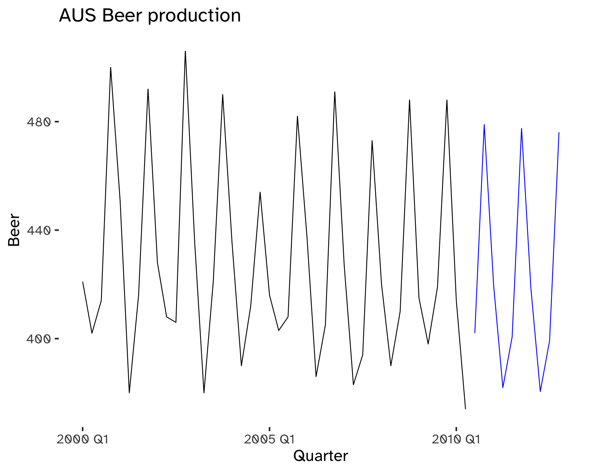
Code
fit <- aus_beer %>%
  model(
    ETS(
      Beer ~ error("A") + trend("A") + season("A")
    )
  )

fc <- fit %>%
  forecast(
    h = 10
  )
Code
fc %>%
autoplot(
    aus_beer,
    level = NULL
    ) +
  labs(
    title = "AUS Beer production",
    y = "Beer"
    ) +
  guides(
    colour = guide_legend(
      title = "Forecast"
      )
  )
Holt-Winters Multiplicative Method
This model is appropriate when seasonal variations are changing proportionally to the level of the series.
The component form is:
Forecast equation:
\hat{y}_{t + h \vert t} = (l_t + hb_t) s_{t + h - m(k + 1)} \tag{29}
Level equation:
l_t = \alpha \frac{y_t}{s_{t - m}} + (1 - \alpha)(l_{t - 1} + b_{t - 1}) \tag{30}
Trend component:
b_t = \beta^* (l_t - l_{t - 1} - b_{t - 1}) + (1 - \beta^*) b_{t - 1} \tag{31}
Seasonal component:
s_t = \gamma \frac{y_t}{ l_{t - 1} - b_{t - 1}} + (1 - \gamma) s_{t - m} \tag{32}
- k is the integer part of (h - 1)/m. Ensures estimates from the final years are used for forecasting.
- 0 \leq \alpha, \beta^* \leq 1.
- 0 \leq \gamma \leq 1 - \alpha.
- m is the period of seasonality.
With multiplicative methods, seasonality is expressed in relative terms; within each year \sum_i s_i \approx m.
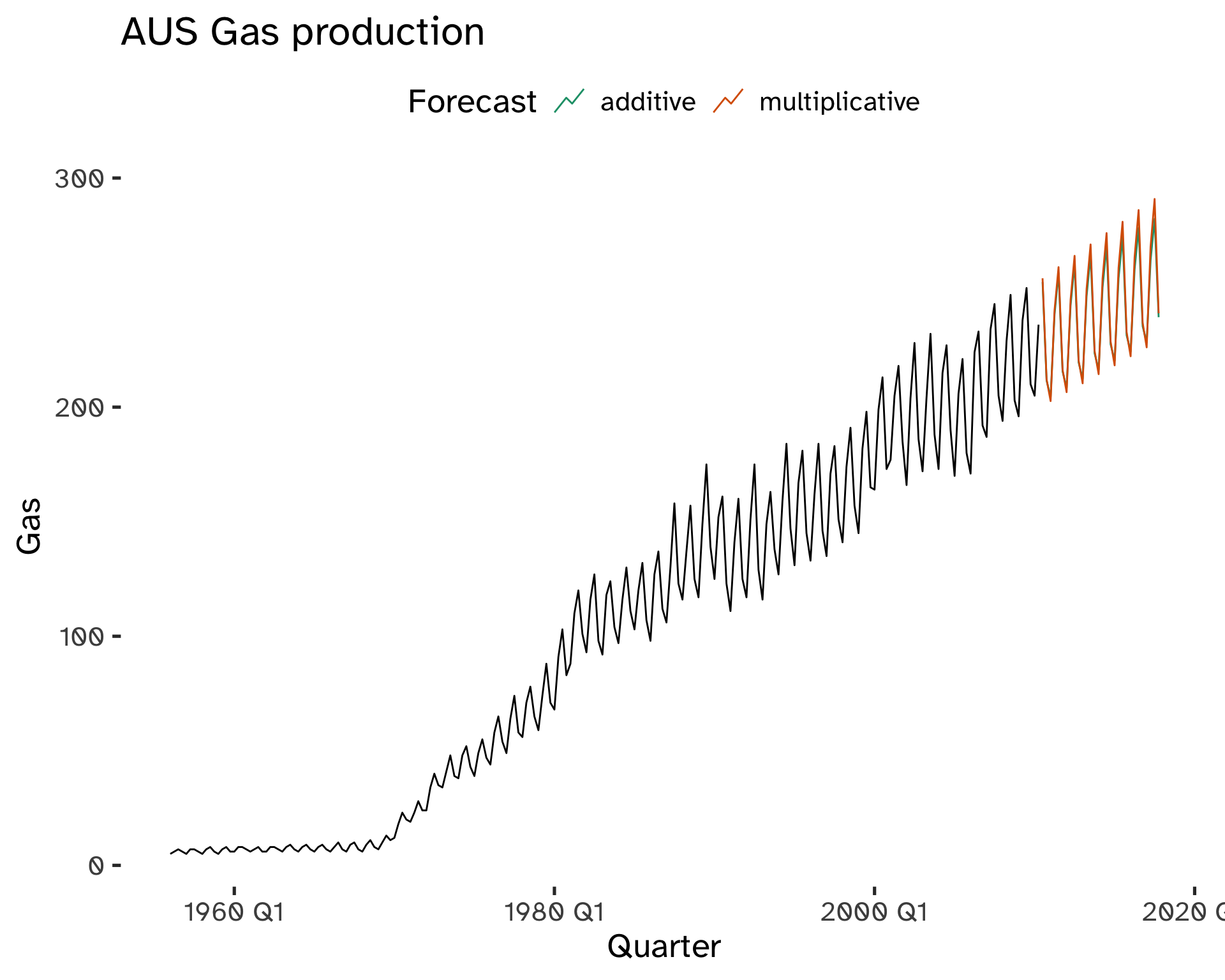
Code
fit <- aus_gas %>%
  model(
    additive = ETS(
      Gas ~ error("A") + trend("A") + season("A")
    ),
    multiplicative = ETS(
      Gas ~ error("A") + trend("A") + season("M")
    )
  )

fc <- fit %>%
  forecast(
    h = 30
  )
Code
fc %>%
autoplot(
    aus_gas,
    level = NULL
    ) +
  labs(
    title = "AUS Gas production",
    y = "Gas"
    ) +
  guides(
    colour = guide_legend(
      title = "Forecast"
      )
  ) +
  scale_color_brewer(
    type = "qual",
    palette = "Dark2"
    )
Holt-Winters Damped Method
This approach combines Holt’s damped method with the seasonality of the Holt-Winters method.
The component form is:
Forecast equation:
\hat{y}_{t + h \vert t} = [l_t + (\phi * \phi^2 + ... + \phi^h) b_t ]s_{t + h - m(k + 1)} \tag{33}
Level equation:
l_t = \alpha \frac{y_t}{s_{t - m}} + (1 - \alpha)(l_{t - 1} + \phi b_{t - 1}) \tag{34}
Trend component:
b_t = \beta^* (l_t - l_{t - 1}) + (1 - \beta^*) \phi b_{t - 1} \tag{35}
Seasonal component:
s_t = \gamma \frac{y_t}{ l_{t - 1} - \phi b_{t - 1}} + (1 - \gamma) s_{t - m} \tag{36}
- k is the integer part of (h - 1)/m. Ensures estimates from the final years are used for forecasting.
- 0 \leq \alpha, \beta^* \leq 1.
- 0 \leq \gamma \leq 1 - \alpha.
- m is the period of seasonality.
Code
fit <- aus_gas %>%
  model(
    "multiplicative+damped" = ETS(
      Gas ~ error("A") + trend("Ad") + season("M")
    ),
    multiplicative = ETS(
      Gas ~ error("A") + trend("A") + season("M")
    )
  )

fc <- fit %>%
  forecast(
    h = 50
  )
Code
fc %>%
autoplot(
    aus_gas,
    level = NULL
    ) +
  labs(
    title = "AUS Gas production",
    y = "Gas"
    ) +
  guides(
    colour = guide_legend(
      title = "Forecast"
      )
  ) +
  scale_color_brewer(
    type = "qual",
    palette = "Dark2"
    )
Footnotes
Any predictive or prescriptive model is based on some steps of descriptive analytics.↩︎
In other words: we are concerned with the dependency of a phenomenon with its own past.↩︎
k = 4, or t-4↩︎
r_k is almost the same as the sample correlation between y_t and y_{t−k}.↩︎
The correlation for k=0 is 0, therefore it is often omitted.↩︎
This is visible at multiples of the seasonal frequency.↩︎
For the transformed data.↩︎
Anytime, a log transformation can turn a multiplicative relationship into an additive relationship.↩︎
Used mostly by government agencies.↩︎
For m=1 we do not have smoothing; for m=n/2 we are smoothing every information out but the mean.↩︎
This works effectively as a weighted moving average.↩︎
E.g.: take the average of all de-trended January values.↩︎
E.g.: take the average of all de-trended January values.↩︎
For \alpha = 0, we revert to the mean method. For \alpha = 1, instead, to the naïve method.↩︎
Data ends at that point.↩︎
Sum of Squared Errors.↩︎
Comments on Classical Decomposition
Its main drawbacks are:
To overcome these drawbacks, common methods used by statistical institutes are STL decomposition and X-11/SEATS.
We will focus on exponential smoothing instead because it provides more general tools.